
Designed an intuitive and efficient checkout flow for an entertainment ticket booking platform. Focused on reducing friction in the purchasing process by streamlining seat selection, payment options, and order confirmation. The design prioritises clarity, accessibility, and user trust through a clean UI, progress indicators, and secure payment integration. Responsive layouts ensure a smooth experience across desktop and mobile devices.
Rethink the current design of the Checkout page with a focus on simplifying the user experience.
Checkout experience improvement, reduce time on task, increase task complete rate
Data Analysis, Research, Wireframes, User Interface Design, High Fidelity Prototype,
Figma
1 week
Create a redesigned version of the Checkout page. The design should enhance clarity and usability, making it easier for users to understand what they are about to book.
To more objectively assess user frustrations, I reviewed online survey results and references related to price transparency, uncertain booking confirmation, and facility information and usage.


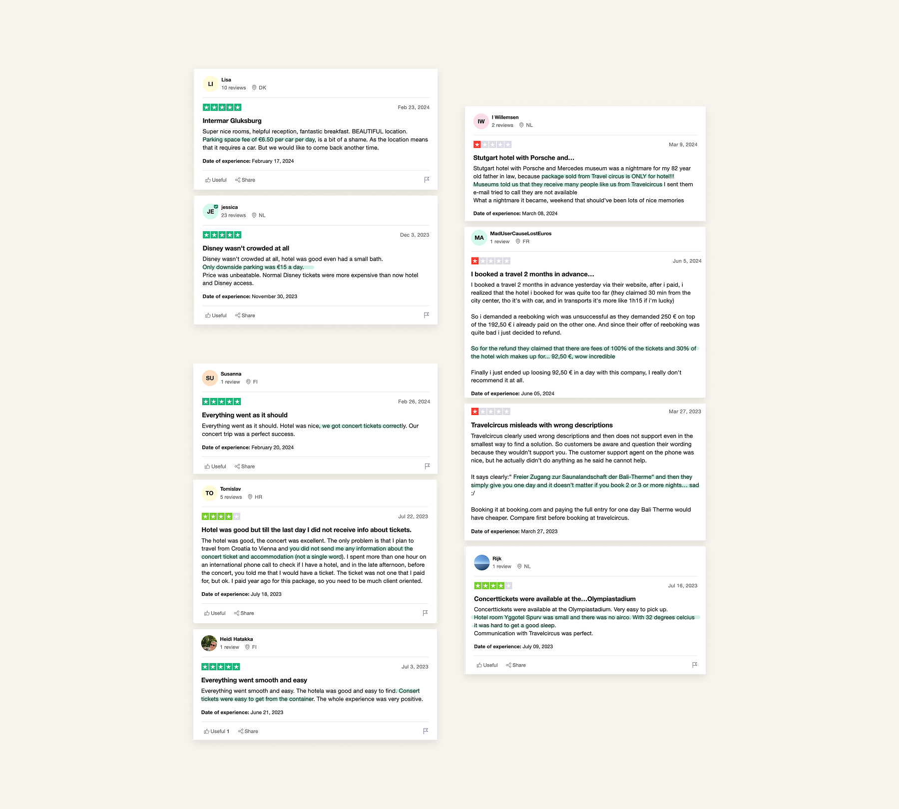
To identify improvements for the checkout page’s booking details summary, I reviewed Trustpilot feedback from 2023-2024 to better understand users’ frustrations. I identified and categorised 3 main issues:

While applying design principles to the ideation process, I focused on addressing cognitive load issues. Although studies often suggest that a one-page checkout can improve conversion rates, Baymard Institute research indicates that usability is more significantly affected by the number of form fields rather than the number of steps. With that in mind, the goals for this design assignment were:

To simplify the lengthy checkout process and minimise potential errors, I redesigned the long form into a multi-step format. This approach allows users to focus on one task at a time, which improves their experience as they proceed through each step.
To validate my design decisions and approach, I will conduct usability testing to better understand users' preferences and frustrations. To measure the success of my design solution, I will include:


© 2026 Olly L.

